Fish & Rice - Brand Identity & Experience Design
Food & Beverage / Hospitality
Brand Strategy, Visual Identity Design, Logo Design, Packaging & Print Design
JEDDAH
2021
This project showcases the creation of a complete brand identity for Fish & Rice, designed to be as fresh, modern, and memorable as its cuisine. The challenge was to avoid industry clichés and build a vibrant, cohesive brand system that felt premium yet approachable. The result is a dynamic visual identity that translated seamlessly across every customer touchpoint, from the logo mark to the final takeaway cup.
Summary
Before serving its first customer, Fish & Rice needed a brand identity that could cut through the noise of a competitive food scene. We were tasked with developing a complete visual world for the restaurant, starting with brand strategy and culminating in a comprehensive system of logos, colors, typography, and print collateral. The identity we crafted captures the energy of modern Asian fusion, creating a unique and highly "Instagrammable" experience that immediately positioned Fish & Rice as a trendy, quality-focused destination.
Challenge
Creating a brand for a modern sushi and Asian restaurant required navigating several key design challenges:
Avoiding Stereotypes: The primary challenge was to create an identity that felt authentically Asian-inspired without resorting to tired clichés like bamboo fonts, dragons, or stereotypical red-and-black color schemes.
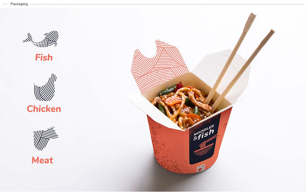
Creating a Cohesive System: The brand couldn't just be a logo. It needed to be a flexible system that would look consistent and professional on everything: a tiny business card, a takeaway paper cup, the restaurant menu, and the main sign on the wall.
Designing for the Digital Age: The identity needed to be bold and graphic, designed to pop on a social media feed and encourage user-generated content, effectively turning customers into brand ambassadors.
Solutions
Our solution was to build a brand identity rooted in a core concept of "Vibrant Modernity." This was expressed through three key design pillars:
A Smart, Memorable Logo: The logo mark is clean and conceptual. The central "O" is cleverly formed by a stylized fish, creating an immediate connection to the name and core product. The modern, sans-serif font is friendly and legible, balancing the playful icon with a clean, professional look.
A Fresh & Unexpected Color Palette: We intentionally moved away from traditional colors. A vibrant, energetic coral was chosen to represent freshness (evoking salmon) and youthful energy. This was paired with a deep, sophisticated charcoal navy to anchor the brand in quality and give it a premium, modern edge.
A Comprehensive Brand World: As showcased in the brand assets, the identity was built to be a complete system. The unique color palette, clean typography, and subtle graphic textures were applied across all materials—including letterheads, business cards, envelopes, and packaging—creating a unified and immersive brand experience at every single touchpoint.
.png)